Custom Pages
Customers could decide to extend Witboost by adding custom pages, which will be embedded inside the user interface.
Right now there are some main extension points that customers can use to add custom pages: the marketplace (a new tab in the project page, a new tab in the consumable interface page, or a new menu entry) and the builder (a new tab in the system page, or a new tab in the component page). In the future, Witboost can expand this mechanism to let customers add custom pages to more parts of the platform's user interface leveraging the same mechanism.
Microfrontend Overview
With extensions, we mean a paradigm that helps you integrate your custom pages inside Witboost. Generally speaking, an extension can be everything that can be integrated inside a React app, from an HTML page to an entire React application. The supported way to create extensions with your custom pages is using microfrontends.
With Microfrontend we mean a simple standalone application with a dedicated UI that displays details regarding a specific entity. These regular applications, if configured accordingly, can be embedded directly inside Witboost as microfrontends.
This solution represents a suitable way of performing an integration without the need to edit Witboost code or restarting it to make changes. It is based on two actors: a Container (Witboost) and a remote application (microfrontend). When applying this solution, keep in mind the following principles:
- Each Frontend is developed independently from the container integrating it.
- The development of remote frontend is technology agnostic, so each frontend can be developed in React, Angular, Ajax or whatever technology. The following guide is focused on React applications, which are fully supported at the moment.
- Every time a remote microfrontend is modified, the developers don't have to coordinate with the Container which has to only reload the page to have everything up-to-date.
- The remote frontend application must be up and running to be displayed inside Witboost.
The following guide will show you how to create a custom page by creating a React application from scratch, and how to integrate it into Witboost.
Microfrontend app example
Let's see how we can create a microfrontend React application from scratch.
To generate a new microfrontend repository, we propose a guide using npx. To install npx, just run:
npm install -g npx
First of all, create a new react typescript application with:
npx create-react-app microfrontend --template typescript
Add a new config-overrides.js file to the project root to change the default webpack configuration:
//config-overrides.json
module.exports = {
  webpack: (config, env) => {
    config.optimization.runtimeChunk = false;
    config.optimization.splitChunks = {
      cacheGroups: {
        default: false,
      },
    };

    config.output.filename = 'static/js/[name].js';
    config.plugins[5].options.filename = 'static/css/[name].css';
    config.plugins[5].options.moduleFilename = () => 'static/css/main.css';
    return config;
  },
};
The lines above tell webpack where to put all the compilation results and the static files. These are made available to the Container application which extends its context with this remote frontend. The Container communicates with this remote frontend by using the window object. So we need to expose to the container a method that renders the microfrontend and one to remove it.
To do this, change the src/index.tsx file by replacing its content with:
// src/index.tsx
import React from 'react';
import ReactDOM from 'react-dom';
import App from './App';

export type MicroFrontendContract = {
  containerId: string;
  theme: DefaultTheme;
  token: string;
};

declare global {
  interface Window {
    renderApplication: (params: MicroFrontendContract) => void;
    unmountApplication: (containerId: string) => void;
  }
}

window.renderApplication = params => {
  ReactDOM.render(
    <React.StrictMode>
      <App />
    </React.StrictMode>,
    document.getElementById(containerId),
  );
};

window.unmountApplication = containerId => {
  const el = document.getElementById(containerId);
  if (!el) {
    return;
  }

  ReactDOM.unmountComponentAtNode(el);
};
This will add two new functions to the window. Here we added the functions renderApplication and unmountApplication, but you should use more on-point names, which represent better the application rendering/unmounting. E.g. if your microfrontend is an observability dashboard, the <application> name could be observability-dashboard and the two functions in the index.tsx could be called renderObservabilityDashboard and unmountObservabilityDashboard.
Then, in the public/index.html file, you need to add the following code to the body:
<!--public/index.html-->
...
<body>
  <div id="root"></div>
  <script type="text/javascript">
    window.onload = () => {
      window.renderApplication('root');
    };
  </script>
</body>
Also here you need to change the function name accordingly (in the example above window.renderObservabilityDashboard('root')).
To start the development server, run PORT=4200 npm start.
Open your browser and navigate to http://localhost:4200. The manifest is available at http://localhost:4200/asset-manifest.json.
The port 4200 is chosen arbitrarily, you can change it if it's already in use by some other application.
Using the Witboost theme
By default, Witboost passes a parameter to the mount function that is specified in the configuration containing the Witboost's theme.
It is strongly recommended to use Witboost's theme inside your microfrontend app, and to do so, you must install the following dependencies:
"@material-ui/core": "^4.12.2",
"@material-ui/icons": "^4.9.1",
"@material-ui/lab": "4.0.0-alpha.57",
Using MUI v4 requires React version 17 to work, so you need to update the other dependencies properly. Here's a working example:
"@material-ui/core": "^4.12.2",
"@material-ui/icons": "^4.9.1",
"@material-ui/lab": "4.0.0-alpha.57",
"@testing-library/jest-dom": "^5.10.1",
"@testing-library/react": "^12.1.3",
"@testing-library/user-event": "^14.0.0",
"@types/jest": "^27.5.2",
"@types/node": "^16.18.41",
"@types/react": "^17",
"@types/react-dom": "^17",
"react": "^17.0.2",
"react-dom": "^17.0.2",
"react-scripts": "5.0.1",
"typescript": "^4.9.5",
"web-vitals": "^2.1.4"
Then, you can import Witboost's theme which is passed as a field of the parameter to your mount function, by changing the src/index.tsx file:
// src/index.tsx
import React from 'react';
import ReactDOM from 'react-dom';
import App from './App';
import { DefaultTheme } from '@material-ui/styles';

export type MicroFrontendContract = {
  containerId: string;
  theme: DefaultTheme;
  token: string;
};

declare global {
  interface Window {
    renderApplication: (params: MicroFrontendContract) => void;
    unmountApplication: (containerId: string) => void;
  }
}

window.renderApplication = params => {
  ReactDOM.render(
    <React.StrictMode>
      <App theme={params.theme} />
    </React.StrictMode>,
    document.getElementById(containerId),
  );
};

window.unmountApplication = containerId => {
  const el = document.getElementById(containerId);
  if (!el) {
    return;
  }

  ReactDOM.unmountComponentAtNode(el);
};
and overriding the default theme using a <ThemeProvider> in the src/App.tsx file.
This can be done by adding the <ThemeProvider> and the <StylesProvider>.
The final App.tsx file should look something like:
// src/App.tsx
import React from 'react';
import './App.css';
import { DefaultTheme } from '@material-ui/styles';
import {
  StylesProvider,
  createGenerateClassName,
} from '@material-ui/core/styles';
import { ThemeProvider } from '@material-ui/core';

const generateClassName = createGenerateClassName({
  seed: 'MyMicrofrontendExample',
});

interface Props {
  theme: DefaultTheme;
}

function App({ theme }: Props) {
  return (
    <StylesProvider injectFirst generateClassName={generateClassName}>
      <ThemeProvider theme={theme}>
        <div className="App">App Content</div>
      </ThemeProvider>
    </StylesProvider>
  );
}

export default App;
For the style provider, we need to define a class prefix for the microfrontend, that you can customize with a seed as shown above. Replace the 'MyMicrofrontendExample' seed with a value that uniquely identifies your microfrontend.
Please note that the StylesProvider also change the CSS injection priority. If this is not set, the application could be rendered in the wrong way, since CSS priority will not be under the application's control and other components could collide with the generated classes.
For the same reason, avoid putting explicit CSS files, and use the MUI's makeStyles and createStyles instead.
Passing additional parameters
Apart from the theme, the application will receive additional standard parameters, like the container identifier and the witboost token (that can be used to validate access requests).
Furthermore, using the window function, it's possible to pass additional custom parameters and use them inside the microfrontend. Be sure to declare them inside the global Window interface and update the witboost's configuration accordingly.
First, you can define the new parameters in the scr/index.tsx file:
// src/index.tsx
import React from 'react';
import ReactDOM from 'react-dom';
import App from './App';
import { DefaultTheme } from '@material-ui/styles';
import { createTheme } from '@material-ui/core';

export type MicroFrontendContract = {
  containerId: string;
  theme: DefaultTheme;
  token: string;
  parameters: {
    additionalParam1: any;
    additionalParam2: any;
    /*
    ... other additional parameters
    */
  };
};

declare global {
  interface Window {
    renderApplication: (params: MicroFrontendContract) => void;
    unmountApplication: (containerId: string) => void;
  }
}

window.renderApplication = params => {
  // Now you can use the additional parameters inside your microfrontend app

  ReactDOM.render(
    <React.StrictMode>
      <App
        theme={params?.theme}
        param1={params?.parameters?.additionalParam1}
        param2={params?.parameters?.additionalParam2}
      />
    </React.StrictMode>,
    document.getElementById(containerId),
  );
};

window.unmountApplication = containerId => {
  const el = document.getElementById(containerId);
  if (!el) {
    return;
  }

  ReactDOM.unmountComponentAtNode(el);
};
and then use them in the src/App.tsx file:
import React from "react";
import "./App.css";
import { DefaultTheme } from "@material-ui/styles";
import { StylesProvider, createGenerateClassName } from "@material-ui/core/styles";
import { ThemeProvider } from "@material-ui/core";

...

export interface Props {
  theme: DefaultTheme;
  param1: any;
  param2: any;
}

export function App(props: Props) {
  const { theme, param1, param2 } = props;
  return (...);
}
Adding the microfrontend to witboost
As introduced above, witboost currently supports a few integration points where microfrontend custom pages can be added.
Microfrontends can be configured and added directly from the user interface in the Administration > Configuration > CustomPages section. This section provides two separate tabs:
-
Marketplace : for configuring microfrontends for the marketplace module, where you can add custom pages for:
-
page: a new page accessible from the marketplace navigation menu -
projectPage: a new tab in the marketplace product's detail page -
consumableInterfacePage: a new tab in the marketplace consumable interface's detail page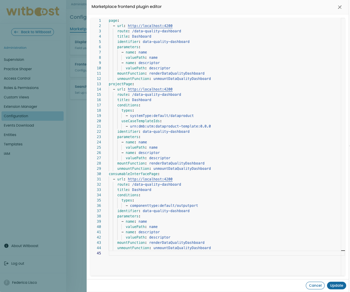
-
-
Builder : for configuring microfrontends for the builder module, where you can add custom pages for:
-
systemPage: a new tab in the builder system's page -
componentPage: a new tab in the builder component's page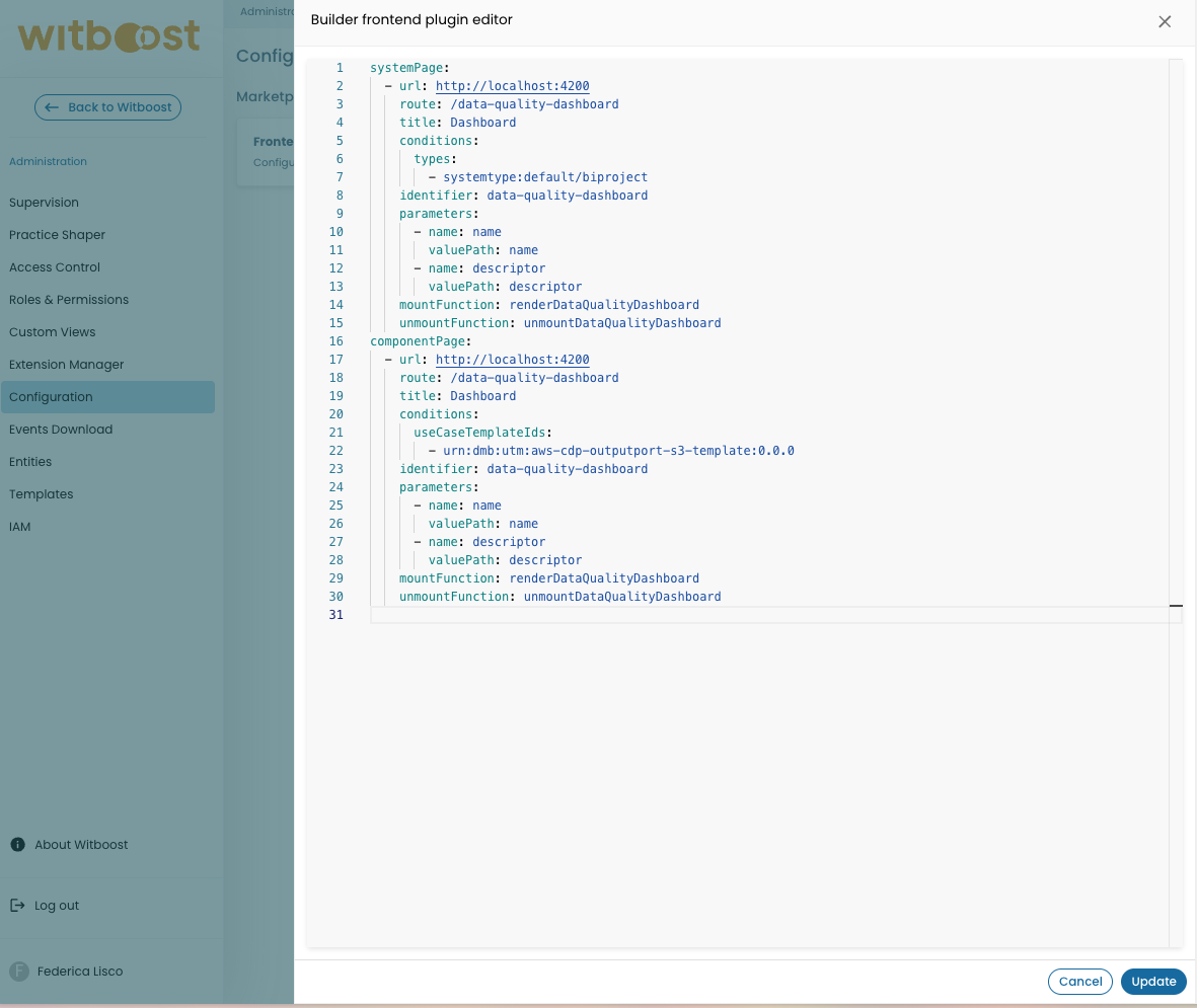
-
You can configure multiple custom pages, each with its own specific settings and parameters.
Each custom page is configured in the following way:
- title: 'Microfrontend project test'
  url: 'http://localhost:4200'
  route: '/test-microfrontend'
  identifier: 'test-microfrontend'
  mountFunction: 'renderApplication'
  unmountFunction: 'unmountApplication'
  conditions:
    types:
      - systemtype:default/dataproduct
    useCaseTemplateIds:
      - 'urn:dmb:utm:dataproduct-template:0.0.0'
  parameters:
    - name: 'name'
      valuePath: 'name'
    - name: 'descriptor'
      valuePath: 'descriptor'
Let's see what each configuration key represents:
| Configuration | Description | Rules |
|---|---|---|
| title | Name of the page as displayed in the tab | Non-empty string |
| url | URL of the microfrontend, used to fetch the manifest | Valid URL string |
| route | The witboost's route that the page will be loaded at | Non-empty string starting with "/" |
| identifier | Unique identifier of the content | Non-empty string with only alphanumeric characters, "-", and "_" (must comply with the regex: ^[a-zA-Z0-9_-]*$) |
| mountFunction | Name of the microfrontend's function that loads the content | Non-empty string (name of the mount function as defined in the index.tsx file) |
| unmountFunction | Name of the microfrontend's function that removes the content | Non-empty string (name of the unmount function as defined in the index.tsx file) |
| parameters | Array of parameters that will be passed as the microfrontend's input | Array of configurations, one for each parameter |
| parameters.name | The parameter's name | Non-empty string |
| parameters.valuePath | The path of the input object that is used to extract the parameter's value | Non-empty string that represents an object path with ".". If the configured path does not exist, the parameter will be undefined |
| conditions | Optional conditions to control when the microfrontend is displayed | Object with optional fields (not available for page type) |
| conditions.types | List of system types or component types for which the microfrontend will be shown. | Array of entity ref (eg. systemtype:default/dataproduct or componenttype:default/outputport ) |
| conditions.useCaseTemplateIds | Array of use case template IDs for which the microfrontend will be shown. | Array of urn (eg. urn:dmb:utm:dataproduct-aws-cdp-template:0.0.0) |
The conditions field is available for all custom page types except page. When conditions are specified, the microfrontend will only be displayed if the current entity matches the specified criteria.
Example
Let's analyze the example configuration below:
- title: 'Microfrontend project test'
  url: 'http://localhost:4200'
  route: '/test-microfrontend'
  identifier: 'test-microfrontend'
  mountFunction: 'renderApplication'
  unmountFunction: 'unmountApplication'
  conditions:
    types:
      - systemtype:default/dataproduct
    useCaseTemplateIds:
      - 'urn:dmb:utm:dataproduct-template:0.0.0'
  parameters:
    - name: 'name'
      valuePath: 'name'
    - name: 'descriptor'
      valuePath: 'descriptor'
This configuration creates a microfrontend tab that will appear only on projects that meet all the following criteria:
- The system type is
systemtype:default/dataproductAND - The use case template ID is
urn:dmb:utm:dataproduct-template:0.0.0
Conditions Logic
The conditions work with AND logic between different condition types:
- If both
typesanduseCaseTemplateIdsare specified, the entity must match at least one of the types AND at least one of the use case template IDs - Within each condition array (e.g., multiple types or multiple template IDs), the logic is OR - the entity needs to match at least one of the values in the array
Examples:
types: [systemtype:default/dataproduct, systemtype:default/bi-project]= entity must be a data product OR a BI ProjectuseCaseTemplateIds: [urn:dmb:utm:dataproduct-template:0.0.0, urn:dmb:utm:dataproduct-aws-cdp-template:0.0.0]= entity must use urn:dmb:utm:dataproduct-template:0.0.0 OR urn:dmb:utm:dataproduct-aws-cdp-template:0.0.0- Both conditions together = entity must be (data product OR BI Project) AND (urn:dmb:utm:dataproduct-template:0.0.0 OR urn:dmb:utm:dataproduct-aws-cdp-template:0.0.0)
Passing parameters to the microfrontend
As shown above, you can pass multiple input parameters to your microfrontend. Those parameters can then be used by the microfrontend itself to render different details depending on where the microfrontend is invoked. But how do these parameters work?
When the microfrontend is invoked, depending on the page where it will be displayed, witboost will have a different object to pass as input:
| Module Name | Page Name | Microfrontend Input |
|---|---|---|
| Marketplace | Product Page | the selected marketplace product |
| Marketplace | Consumable Interface Page | the selected consumable interface |
| Marketplace | Page | no parameters are passed |
| Builder | System Page | an object containing the selected builder's system entity |
| Builder | Component Page | an object containing the selected builder's component entity |
Since we don't need to pass too many unused values to the microfrontend, in the configuration you can choose which fields of the input objects your microfrontend will need.
The parameters will take values from the relative input object's fields, hence you need to know which structure you can use when configuring the parameters' value paths to extract the fields. For example, if the input object is { metadata: { name: 'test-name', description: 'test-description' }}, you can pass to the microfrontend only the test-name value by adding a parameter like name: 'name', valuePath: 'name'.
The input objects that you can use to extract the parameters differ from page to page. Here some examples of input objects:
- Marketplace Project Page:
{
    "id": 103363,
    "version": "0.1.0",
    "descriptor": { ... },
    "published_at": "2025-01-17T08:00:53.236867+00:00",
    "name": "Customer Details",
    "display_name": "Customer Details",
    "domains": [
        {
            "data": {
                "name": "DPU",
                "external_id": "urn:dmb:dmn:dpu"
            }
        }
    ],
    "description": "Provides information about the financial status of the customers",
    "owner": "user:john.doe_agilelab.it",
    "owner_display_name": "John Doe",
    "external_id": "urn:dmb:dp:dpu:customer-details:0",
    "taxonomy": {
        "id": 1,
        "external_id": "urn:dmb:taxonomy:data-mesh-taxonomy",
        "name": "Data Mesh"
    },
    "environment": {
        "id": 2,
        "name": "production"
    },
    "shoppable": "HAS_SHOPPABLE_CHILD",
    "consumable": "HAS_CONSUMABLE_CHILD",
    "kind": "system",
    "type": "dataproduct"
}
- Marketplace Consumable Interface Page:
{
    "id": 103371,
    "name": "Customer Risk Assessment",
    "display_name": "Customer Risk Assessment",
    "version": "1.0.1",
    "descriptor": { ... },
    "outputporttype": "SQL",
    "components": [],
    "external_id": "urn:dmb:cmp:dpu:customer-details:0:customer-risk-assessment",
    "description": "Provides information about the financial risk of the customers",
    "shoppable": "SHOPPABLE",
    "consumable": "CONSUMABLE",
    "published_at": "2025-01-17T08:00:53.236867+00:00",
    "type": "outputport",
    "kind": "component",
    "environment": {
        "name": "qa"
    },
    "parentComponent": [],
    "system": [{ ... }],
    "dataContract": {
        "policy_id": "8dc2af1f-6cd9-4d71-807d-dab0076f244c"
    }
}
- Builder System Page:
{
    "entity": {
        "metadata": {
            "namespace": "default",
            "annotations": {
                "backstage.io/managed-by-location": "url:https://my-git-provider/path/-/blob/main/catalog-info.yaml",
                ...
            },
            "name": "organization.employees.0",
            "description": "Employees",
            "classDetails": {
                "displayName": "Data Product"
            },
            "uid": "d9e700e5-e8a8-4567-957d-25ff249eb70d",
            "etag": "bad9521b4bd71cd50e7021b70c05f1d86a5776b2"
        },
        "apiVersion": "backstage.io/v1alpha1",
        "kind": "System",
        "spec": {
            "type": "dataproduct",
            "lifecycle": "experimental",
            "owner": "group:datameshplatform",
            "domain": "domain:organization",
            "mesh": {
                "name": "Employees",
                "fullyQualifiedName": "Employees",
                "version": "0.17.0-SNAPSHOT-1",
                "useCaseTemplateId": "urn:dmb:utm:dataproduct-template:0.0.0",
                "infrastructureTemplateId": "urn:dmb:itm:cdp-aws-dataproduct-provisioner:1",
                "dataProductOwner": "user:john.doe_agilelab.it",
                "email": "john.doe@agilelab.it",
                "informationSLA": null,
                "status": "Draft",
                "maturity": null,
                "billing": {},
                "tags": [],
                "specific": {},
                "projectOwner": "user:john.doe_agilelab.it",
                "consumable": false,
                "shoppable": false
            },
            "instanceOf": "systemtype:default/dataproduct"
        },
        "relations": [
            {
                "type": "ownedBy",
                "targetRef": "user:default/john.doe_agilelab.it",
                "target": {
                    "kind": "user",
                    "namespace": "default",
                    "name": "john.doe_agilelab.it"
                }
            },
            ...
        ]
    }
}
- Builder Component Page:
{
    "entity": {
        "metadata": {
            "namespace": "default",
            "annotations": {
                "backstage.io/managed-by-location": "url:https://my-git-provider/path/-/blob/main/catalog-info.yaml",
                ...
            },
            "name": "organization.employees.0.file-output-port",
            "description": "Storage for files generated by the workload job",
            "tags": [],
            "consumableSubComponents": [],
            "classDetails": {
                "displayName": "Output Port"
            },
            "uid": "a72f3639-5a3f-49c1-a5bb-186bf9b0da21",
            "etag": "7be3e27fb414e0dbddc0c8b015af3207e69d6173"
        },
        "apiVersion": "backstage.io/v1alpha1",
        "kind": "Component",
        "spec": {
            "type": "outputport",
            "lifecycle": "experimental",
            "owner": "user:john.doe_agilelab.it",
            "system": "system:organization.employees.0",
            "domain": "domain:organization",
            "mesh": {
                "name": "File Output Port",
                "fullyQualifiedName": null,
                "description": "Storage for files generated by the workload job",
                "kind": "outputport",
                "version": "0.0.0",
                "infrastructureTemplateId": "urn:dmb:itm:aws-s3-storage-provisioner:1",
                "useCaseTemplateId": "s3-file-outputport-template.1",
                "platform": "S3",
                "technology": "AWS",
                "outputPortType": "Files",
                "creationDate": "2024-02-13T09:51:52.585Z",
                "startDate": "2024-02-13T09:51:52.585Z",
                "processDescription": null,
                "dependsOn": [],
                "tags": [],
                "sampleData": {},
                "semanticLinking": [],
                "consumable": true,
                "shoppable": true
            },
            "instanceOf": "componenttype:default/outputport"
        },
        "relations": [
            {
                "type": "ownedBy",
                "targetRef": "user:default/john.doe_agilelab.it",
                "target": {
                    "kind": "user",
                    "namespace": "default",
                    "name": "john.doe_agilelab.it"
                }
            },
            ...
        ]
    }
}
To summarize, if you want to receive as input for your marketplace's consumable interface the name and the descriptor, you can just add the configurations:
parameters:
  - name: 'dataName'
    valuePath: 'name'
  - name: 'dataDescriptor'
    valuePath: 'descriptor'
In this example, the name will be passed as the dataName parameter, and the descriptor as the dataDescriptor parameter. Note that the name will be passed as a string, while the descriptor will be passed as a complete object.