Common functionalities
Every component has its own set of properties, but some common functionalities are shared among all of them. These functionalities are defined in the base component, which is the parent of all the other components. The properties defined in the base component are the following:
- value: this property is processed as a Nunjucks value, so it can contain variables and expressions.
- path: refers to a path in the data object that will be used as the value. In all the components this is an alternative to the
valueproperty. If both are defined, the path will be used. - showWhenHasValue: shows the component only if its value is defined. This is a
booleanflag. - showWhenExists: shows the component only if the path specified is not undefined. This functionality can also accept an array of paths: in this case, it is sufficient that at least one of them is not undefined. If the specified value is an object, it checks that all its keys are either
nullorundefined: if that is the case, the component is not shown. - hideWhenExists: removes the component from the page if the path specified is defined (specular to the showWhenExists property).
- showWhen: shows the component only if a certain condition defined is true. It is an object that must contain these two properties:
value: a Nunjucks value for the property to check, for example'{{ tags.length }}'equalsornotEquals: the value to check against, for example0; (this is not a Nunjucks value)
- default: sets a default value for the component when, after the value resolution, its value is empty (e.g. if the value is reading from a null or undefined field, the default value will be returned instead).
When using a component, you can always decide between using the value or the path property:
- the
pathproperty is used to reference a field in the data object. - the
valueproperty is used to define a static value, or a Nunjucks string that elaborates the data object.
So, you could use the path property if you want to reference directly the spec.mesh.name field, or you could use the value property if you want to apply some logic to it, like showing spec.mesh.name only when defined, and fallback to metadata.name otherwise: {{ spec.mesh.name if spec.mesh.name else metadata.name }}.
Every time you have a nested component, for example, if you have a child component inside a parent component, the child component will inherit the properties of the parent component in a field called _parent. This is true also for elements inside a sequence or a grid sequence (or arrays in general): every array element will have a _parent field that refers to the parent component.
Simple Components
These components are designed for generic use. Each one can have specific properties.
String Component
The string component displays a string value.

Configurations:
label: Defines the label to show, it will appear above the string.maxLines: Defines the number of lines to show, after which the ellipsis is shown. If set to undefined or -1, the field will not be truncated (default). For values greater than 0, the text field is truncated, and hovering over it will show a tooltip containing the full text.showMoreButton: Determines whether a 'More' button is displayed after the ellipsis. If maxLines is not defined but showMoreButton is set to true, the field will automatically truncate after 3 lines.colSpan: Specifies the width in columns. Number of columns will be depend on the size of the screen. For the smallest size there will be only 1 column, for small size 2 columns, for wide dimensions and beyond 4 columns. The colSpan value will affect the size in relation to the number of columns, so it will be useless for smaller size.href: Specifies the URL to redirect to when clicked. If specified, the string will be shown as a link.hrefTarget: When the href is specified, you can also specify the "target" property for the link, for example "_blank" to open it on a new tab.icon: Specifies a icon to be put on the left of the string value. If you want to use a pre-defined icon, you can set this property directly to the icon name (e.g.active,has_access, etc.). Otherwise, this property can be set to an object that contains the same properties as the icon component. Please refer to the Icon Component section for more details. Example:
- type: string
  label: Name
  path: name
  colSpan: 2
When using links, you can refer to external pages, or to other Witboost pages. For example, if you want to link to the Marketplace Search page, you can use the following configuration:
label: Search Page
type: string
value: 'go to search'
href: '/marketplace/search'
while if you want to open an external link, like a system that is integrated with Witboost, you can use the following configuration:
label: Integration
type: string
value: 'Google'
href: 'https://www.google.com'
hrefTarget: '_blank'
note that when adding an external link, you should always specify the hrefTarget property, to avoid redirecting the user away from the Witboost page.
You can use links also to send emails (by opening the default email client). For example, if you want to send an email to the user stored as owner when clicking on the string, you can use the following configuration:
label: Owner
type: string
value: '{{dataProductOwner | replace("user:", "") | reverse | replace("_", "@", 1) | reverse }}'
href: 'mailto:{{dataProductOwner | replace("user:", "") | reverse | replace("_", "@", 1) | reverse }}'
The pre-processing is needed to convert the Witboost user ID (like "user:john.doe_company.com") to a valid email address ("john.doe@company.com").
Date Component
The date component displays a date value.

Configurations:
label: Defines the label to show, it will appear above the date.dateFormat: Specifies the format of the date (defaults toyyyy/MM/dd HH:mm:ss). You can check the date-fns documentation for the available formats (e.g.eeee, dd MMMM yyyyforWednesday, 22 January 2025).
Example:
- type: date
  path: createdAt
  label: Created At
Cost Display Component
The Cost Display component displays arbitrary cost information.

Configurations:
label: Defines the label to show, it will appear above the cost.locale: Specifies the locale for formatting the cost (e.g.,en-US,it-IT). You can check here for a sample list of the possible locales.currency: Specifies the ISO 4217 currency code. If missing, the number will be displayed without a currency.cadency: Specifies a cadency for the cost. If provided, will be displayed after the cost and a/.
Example:
- type: cost_display
  path: cost
  currency: EUR
  locale: it-IT
  cadency: month
  label: Cost
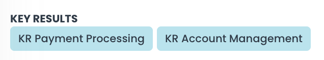
Badge Component
The Badge component displays one or more badges depending on the input value, which can be a single string or object, or an array of strings or objects.
Configurations:
label: Defines the label to show, it will appear above the date.displayValue: this field specifies the value to show for each badge object. It is a Nunjucks string that can reference the badge object. MUST be specified when the value is an object or an array of objects.
Example:
- type: badge
  path: keyResults
  displayValue: '{{name}}'
Stars Component
The Stars component displays a number value as filled stars.

Configurations:
-
label: Defines the label to show, it will appear above the stars. -
maxValue: Specifies what number should map to 5 stars. For example, a value of 100 will appear as 1 filled star out of 5 ifmaxValueis set to 500.
Example:
- type: stars
  label: Importance
  path: importance
Title Component
The title component displays a string as a title using the Typography variant.

Example:
- type: title
  value: Agreement
Icon Component
The icon component displays an icon. It can be used to show a status or an action.
Configurations:
-
value: Specifies the icon to show. This is a string, and depending on its value, it will be interpreted in different ways:-
if you do not specify any prefix, you can use an icon chosen among a list of pre-defined icons. Currently this list contains:
Name Preview cue 
cue_2 
remote 
remote2 
llm 
llm2 
global 
global2 
deploy 
deploy2 
runtime 
runtime2 
owner 
data_contract 
user 
group 
active 
disabled 
has_access partial_access 
no_access pending 
accepted rejected download 
upload 
edit 
domain 
info 
ok 
red_flag 
yellow_flag 
proposed 
wip 
-
if you want to add an existing Material UI icon, you can just add the
mui:prefix to the name of an existing Material Ui icon. For example, you can add a plus icon by using themui:Addvalue. You can find a list of all the existing values in the official Material UI icons documentation. -
if you want to import an existing icon stored outside of the platform, you can add it by using the
external:prefix. After the prefix, you can specify the URL of the icon. For example, you can add an icon by using theexternal:https://myIcon.comvalue.
-
-
color: the color of the icon. It can be specified as a string (e.g.red,blue, etc.) or as a hex color (e.g.#FF0000). The color can be specified only for the Material UI icons (and some pre-defined icons). -
map: Specifies a map of values that, if present, replaces the actual value using the key of the map. This is useful when you want to show a different icon depending on the value of the field, without having to manually map the value to the actual icon string. -
tooltip: Specifies a tooltip to show when hovering over the icon. It can be a static string or a Nunjucks value. This configuration is not available when used inside astringcomponent.
Examples:
- type: icon
  value: active
  tooltip: Active
- type: icon
  value: mui:AddAPhoto
  color: blue
  tooltip: Add a photo of {{name}}
Some other examples using the string field:
- type: string
  label: Project Owner
  value: { { projectOwnerDisplayName } }
  icon: user
- type: string
  label: Project Owner
  value: { { projectOwnerDisplayName } }
  icon:
    value: external:https://myIcon.com
You can use the map feature to display different icons depending on the value of the field. For example, if you want to show a filling battery attached to the environment field, you can use the following configuration:
- label: Environment
  type: string
  value: '{{_computedInfo.environment.name}}'
  colSpan: '4'
  showWhenExists: _computedInfo.environment.name
  icon:
    map:
      development:
        value: mui:Battery20
        color: red
      qa:
        value: mui:Battery50
        color: blue
      production:
        value: mui:BatteryFull
        color: green
    value: '{{_computedInfo.environment.name}}'
Image Component
The image component displays an image.
Configurations:
title: Specifies the alternative string to display when the image is not available.maxHeight: maximum height of the image in pixels (default to 250).
Example:
- type: image
  title: My Image
  value: https://myImage.com
Link Component
The link component displays a reference link to the Entities page. Only valid entity refs are allowed as values.

Configurations:
kind: Specifies the entity kind. It is used to build the link to the correct entity page. (e.g.user,group, ordomain).
Example:
- type: link
  path: myPath
Tags Component
The tags component shows a list of tags. It decodes the OpenMetadata tag format;
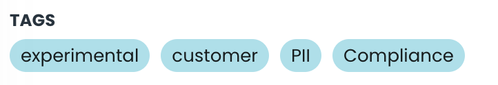
Configurations:
label: label of the widget (fallback totitleif not defined).filter: allows you to specify a filter to show only certain tags. It supports two formats:- when set as a string, it is interpreted as a Nunjucks that should return 'true' when the tag should be shown;
- when set as an object, it is parsed as a complex condition (in the same format as the "showWhen" property). In this case, you can use the
equalsandnotEqualsproperties to filter the tags.
displayValue: this field specifies the value to show for each tag. It is a Nunjucks string that can reference the tag object. If not specified, the tag'stagFQNfield will be shown (as per OpenMetadata definition).
Example:
Given the following input:
myObject:
  label: Business Terms
  tags:
    - label: test
      enabled: true
    - label: test2
and this Custom View:
- type: tags
  path: tags
  displayValue: { { label } }
  filter: { { enabled == true } }
the UI will show only the tag "test".
Another example could be when this input:
myObject:
  tags:
    - name: tag
      description: test
    - name: tag test
      description: test2
    - name: test tag
      description: test3
with this custom view:
- type: tags
  path: tags
  displayValue: { { description } }
  filter: "{{ true if name == null or name.slice(0, 4) != 'test' else false }}"
will show two tags: "test" and "test2"
Radio Component
The radio component shows a radio button. When pressed, it runs an action specified in the click property.
It allows a click property to be called when the radio button is clicked. The click property right now can be assigned only the values specific to the page it is defined in.
Configurations:
click: Specifies the code-defined action.disabled: Specifies, using a Nunjucks value, when this component should be disabled.disabledTooltip: When it is disabled, optionally define a string tooltip to show on hover.
Example:
- type: radio
  click: myAction
  disabled: '{% if shoppable is not defined %} true {% else %} false {% endif %}'
Checkbox Component
The checkbox component shows a checkbox button. When pressed, it runs an action specified in the click property.
It allows a click property to be called when the checkbox button is clicked. The click property right now can be assigned only the values specific to the page it is defined in.
Configurations:
click: Specifies the code-defined action.disabled: Specifies, using a Nunjucks value, when this component should be disabled.disabledTooltip: When it is disabled, optionally define a string tooltip to show on hover.
Example:
- type: checkbox
  click: myAction
  disabled: '{% if shoppable is not defined %} true {% else %} false {% endif %}'
Enabled Component
The enabled component shows a checked circle, grayed if false (depending on the value of the field referenced by the path).

Example:
- type: enabled
  path: available
Automatic Fields List Component
The automatic fields list component shows a list of fields. It is used to display all the first-level primitive fields of an object. E.g. if you have a long list of fields and you don't want to create a component for each one, you can use this component to display them all. You can easily tell the component which fields should be ignored, and the order in which they should be displayed.
Configurations:
exclude: An array of fields to exclude from the list. The fields specified here will not be displayed.order: An array of field names that specifies the order in which the fields should be displayed. All the fields not specified here will be displayed after the ones specified in this array.defaults: Is an object that specifies the default properties for some the fields. If you use the field_default, the properties will be applied to all the fields, unless they are overridden by the field's specific properties.
Example:
- type: automatic_fields_list
  path: myObject
  defaults:
    description:
      colSpan: 4
    id:
      colSpan: 2
  exclude:
    - useCaseTemplateId
    - infrastructureTemplateId
  order:
    - name
    - fullyQualifiedName
    - version
    - creationDate
    - description
Only the first-level primitive fields are displayed. If you want to display nested fields, you should use other components. So for example, if you have an input object like this:
myObject:
  field1: value1
  field2:
    nestedField1: value2
  field3:
    - value3
    - value4
and you define a Custom View like this:
- type: automatic_fields_list
  path: myObject
only field1 will be displayed.
Layout Components
Include Component
The include component allows the inclusion of other Custom View component definitions. If not present, it will show the children defined in place.
Configurations:
id: Specifies the identifier of the custom view to include.typeId: Specifies the entity type for which this should be included. This is an optional field.templateId: Specifies the entity custom template ID for which this should be included. This is an optional field.
If no typeId or templateId is specified, the component will inherit the values from the parent custom view.
Example:
- type: hbox
  children:
    - type: include
      id: builder_system_general
    - type: catalog_relations
In the example above, the include component will include the builder_system_general custom view and then show the catalog_relations component. This is the code used to display the first part of the builder system page:
Grid List Component
The grid list component places its children in a spaced vertical column. This is usually used to show a list of cards, but it can be used to display any component as a vertical column.
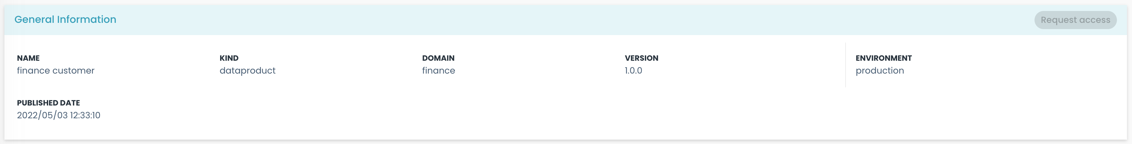
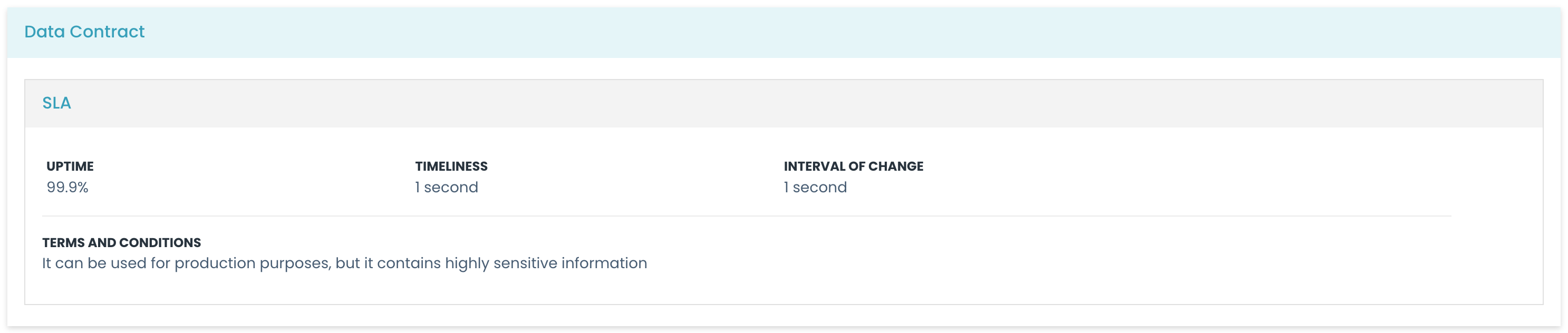
In the image above, the cards "General Information", "Technical Information", and "Data Contract" are placed in a vertical column using the grid list component.
Configurations:
children: contains an array of all components that will be shown inside this component.
Example:
- type: grid_list
  children:
    - type: string
      value: My String
    - type: string
      value: My Other String
Container Component
The container component defines an area to place elements in a sequence with more fine control. The child elements could be any component and are placed in a sequential disposition, following the traditional flow rules (left-right, top-bottom).
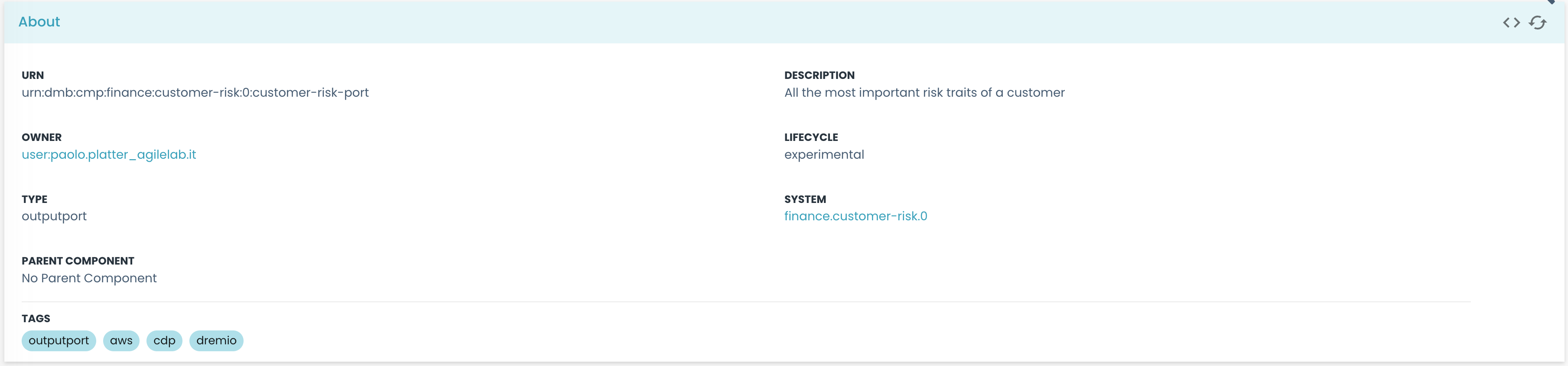
In the image above, the container component is used to place the string children (that will be adapted using their "colSpan" property to take up the space they need). Please note, that inside the container, there is another container on the right with a visible left border.
Configurations:
children: contains an array of all components that will be shown inside this component.spacing: Specifies the spacing between elements (default to 3).borderLeft: If present, the container will display a solid border on the left side.borderRight: If present, the container will display a solid border on the right side.borderTop: If present, the container will display a solid border on the top side.borderBottom: If present, the container will display a solid border on the bottom side.
Example:
- type: container
  spacing: 10
  children:
    - type: string
      path: name
      label: Name
    - type: string
      path: description
      label: Description
Horizontal Box Component
The horizontal box component shows all its children in a horizontal disposition. Each child can have a size property, that is assigned internally to the flex css property.
Usually, every child will have a reserved space that is proportional to the total sum of the children's sizes.
In this image, you can see how the two "container" components are placed in a horizontal disposition. The one on the left has a size of 3, and the second one has a size of 1. This means that the first container will take up 75% of the total space, and the second one will take up 25%. You can see the two containers are separated by a vertical line, since the second container has a border on the left side.
Configurations:
children: contains an array of all components that will be shown inside this component. Every child component can define asizeproperty to specify its relative width.responsive: if responsive is set to true, on smaller screens, elements will be arranged vertically in a column. Instead for larger screens, the items will be arranged horizontally as described above. Default is false.
Example:
- type: hbox
  children:
    - type: string
      path: name
      label: Name
      size: 3
    - type: string
      path: description
      label: Description
In this example, the string will take 75% of the total size, and the latter will fill up the remaining 25%.
Horizontal Component
The horizontal component shows all its children in a horizontal flow disposition. This differs from the container because overflowing elements will not go into new lines.
This component will also not equally space the elements, but will instead let them take up the space they need.
Configurations:
children: contains an array of all components that will be shown inside this component.
Example:
- type: horizontal
  children:
    - type: string
      path: name
      label: Name
    - type: string
      path: description
      label: Description
Card Component
The card component shows all its children inside a card container.
Configurations:
title: Specifies the title of the card.noDataCheck: Specifies a condition that, when false, replaces the card with a no-data content.noDataLabel: Specifies the message to be shown when no data is detected.children: contains an array of all components that will be shown inside this component.
Example:
- type: card
  title: My Card
  noDataCheck: false
  noDataLabel: No data available
  children:
    - type: string
      path: name
      label: Name
    - type: string
      path: description
      label: Description
Sub Card Component
The sub_card component shows all its children inside a sub-card widget. Sub-cards can be drawn inside other cards.
Configurations:
title: Specifies the title of the sub-card.noDataCheck: Specifies a condition that, when false, replaces the card with a no-data content.noDataLabel: Specifies the message to be shown when no data is detected.children: contains an array of all components that will be shown inside this component.
Example:
- type: sub_card
  title: My Sub Card
  noDataCheck: false
  noDataLabel: No data available
  children:
    - type: string
      path: name
      label: Name
    - type: string
      path: description
      label: Description
No data Component
The no data component shows data if its value (value or path) is defined, otherwise it shows a no-data object with a label.
In the Card Component this behavior is available through the noDataCheck and noDataLabel properties.
Configurations:
children: contains the element (or elements) that are shown when the value is defined.
Example:
- type: no_data
  value: myValue
  label: No data available
  children:
    - type: string
      path: description
      label: Description
Vertical Space Component
The vertical space component shows a space positioned vertically.
Example:
- type: vspace
Horizontal line Component
The horizontal line component shows a horizontal line of separation.
Here you can see the horizontal line separating the "Tags" section from the rest of the card.
Example:
- type: hline
Sequence Component
The sequence component replicates all its children for each element of an array referenced by the path property. It redefines the root for the paths on the selected element: if the path is myArray, the root for the children will be myArray![i].
The sequence component works only if the value or path fields reference a field that is an array.
Configurations:
children: contains the element (or elements) that are shown for each array element.
Example:
- type: sequence
  path: myArray
  children:
    - type: string
      value: name
      label: Name
    - type: string
      value: description
      label: Description
In the example above, the sequence component will replicate the two string components for each element in the myArray array. The example above would be capable of displaying a list of names and descriptions like:
myArray:
  - name: Name1
    description: Description1
  - name: Name2
    description: Description2
Grid Sequence Component
The grid sequence component is similar to the sequence component, but it places the replicas in a spaced grid.
By iterating on every type of the array's elements, the grid list creates an instance for each element, placing them in a grid disposition.
Configurations:
children: contains the element (or elements) that are shown for each array element.
Example:
- type: grid_sequence
  path: myArray
  children:
    - type: string
      value: name
      label: Name
    - type: string
      value: description
      label: Description
Table Component
The table component shows a table starting from an array of objects. Each child represents a column and is required to have a label property.
It allows a click property to be called when a row is clicked. The click property right now can be assigned only the values specific to the page it is defined in.
The table component now supports advanced filtering capabilities. Filters can be defined for each column, allowing users to refine the displayed data based on various criteria.
Configurations:
-
click: Specifies the code-defined action. -
showRowWhen: Works asshowWhen, but specific for table rows. It can be used to show only elements with a specific value. -
maxHeight: Specifies the maximum height of the table. When defined and valid, the table body scrolls vertically within the specified height. If not defined, the table expands freely with no height limit. If defined but invalid, the value is silently ignored. Accepted values are:- Numbers (interpreted as pixels), e.g.
400 - CSS strings with units
px,vh,vw,em,rem, e.g."50vh","300px","2em" calc(...)expressions, e.g."calc(100vh - 200px)"
notePercentage values (
%) are not accepted, as they require the parent container to have an explicit height, which is not guaranteed in the custom views layout. - Numbers (interpreted as pixels), e.g.
Each element has the following configurations:
label: the column title (falls back to the fieldtitleif not defined)warningIf the
labelis defined as a Nunjucks, it refers to the root element as seen by the table, not by the row. Thevalueproperty works as usual instead, having as root the row element.width: column width (recommended in %)sortable: only applies to columns withtype: string. Enables sorting on the column (default: true)resizable: disables column resizing (default: true)
Filter Configurations:
Filters are configured through the filters prop, which is an array of filter objects. Each filter object has the following structure:
interface Filter {
  column: string;
  type: 'search' | 'boolean' | 'multiselect' | 'select';
  path?: string;
  placeholder?: string;
}
column: The name of the column to filter, must match the label field present in children otherwise it will not work.type(optional): The type of filter to apply. Supported types are:search: A text input for free-text searching.boolean: A checkbox for true/false filtering.multiselect: A multi-select dropdown for choosing multiple values.select(default) : A single-select dropdown for choosing one value.
path(optional): The path to the property in the data object. If not provided, it will use the column's path.placeholder(optional): Custom placeholder text for the filter input. Works only for 'search' type. Defaults to 'Search by column'
Example:
- type: table
  path: myArray
  click: myAction
  maxHeight: "50vh"
  filters:
    - column: Name
      type: search
      placeholder: Search by name
    - column: Type
      type: multiselect
    - column: Version
      type: select
    - column: Access
      type: boolean
  showRowWhen:
    value: '{{ name }}'
    equals: Name1
  children:
    - label: Name
      path: name
      sortable: true
    - label: Description
      path: description
      width: 50%
    - type: string
      path: type
      label: Type
      width: 20%
    - type: string
      path: version
      label: Version
      width: 20%
    - type: enabled
      path: access
      label: Access
      width: 10%
      resizable: false
The example above, is capable of rendering as a table the following YAML data, by excluding the second row:
myArray:
  - name: Name1
    description: Description1
  - name: Name2
    description: Description2
New Root Component
The new root component redefines the root for its children components. This is useful when you want to change the root of the children components to a different object: e.g. you have a source object "myObject" and you want to reference its children as if "myObject" were the root object.
Configurations:
path: Specifies the new root path.
Example:
- type: new_root
  path: myObject
  children:
    - type: sequence
      path: myArray
      children:
        - type: string
          value: name
          label: Name
        - type: string
          value: description
          label: Description
This would work for a source object like:
myObject:
  myArray:
    - name: Name1
      description: Description1
    - name: Name2
      description: Description2
Marketplace Components
Marketplace Questions Component
The marketplace questions component shows a question and answers box.
In this case, the path and value properties are not used. These components must be used in the marketplace pages, and they are not customizable.
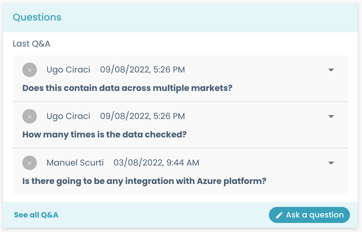
Example:
- type: marketplace_questions
Marketplace Review Component
The marketplace review component shows a review box.
In this case, the path and value properties are not used. These components must be used in the marketplace pages, and they are not customizable.
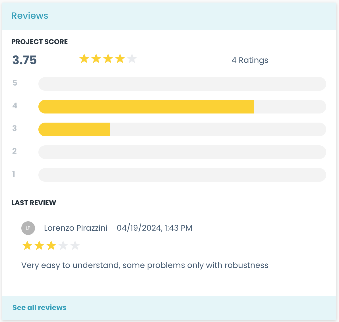
Example:
- type: marketplace_review
Marketplace Dependency Component
The marketplace dependency component shows the dependency graph.
In this case, the path and value properties are not used. These components must be used in the marketplace pages, and they are not customizable.
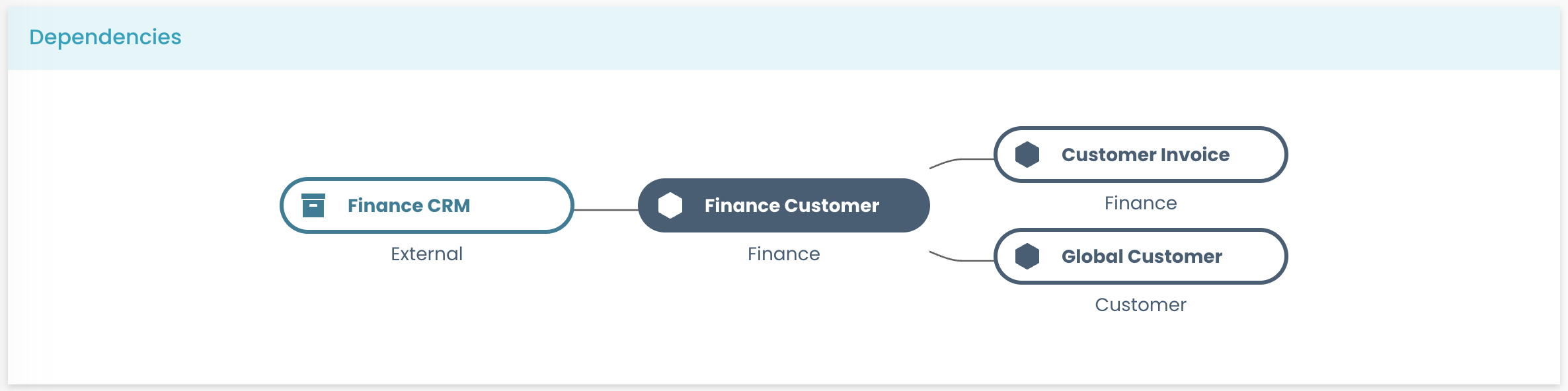
Example:
- type: marketplace_dependency
Marketplace Flag and Score Component
The marketplace flag and score component shows the metrics and policies' results.
In this case, the path and value properties are not used. These components must be used in the marketplace pages, and they are not customizable.
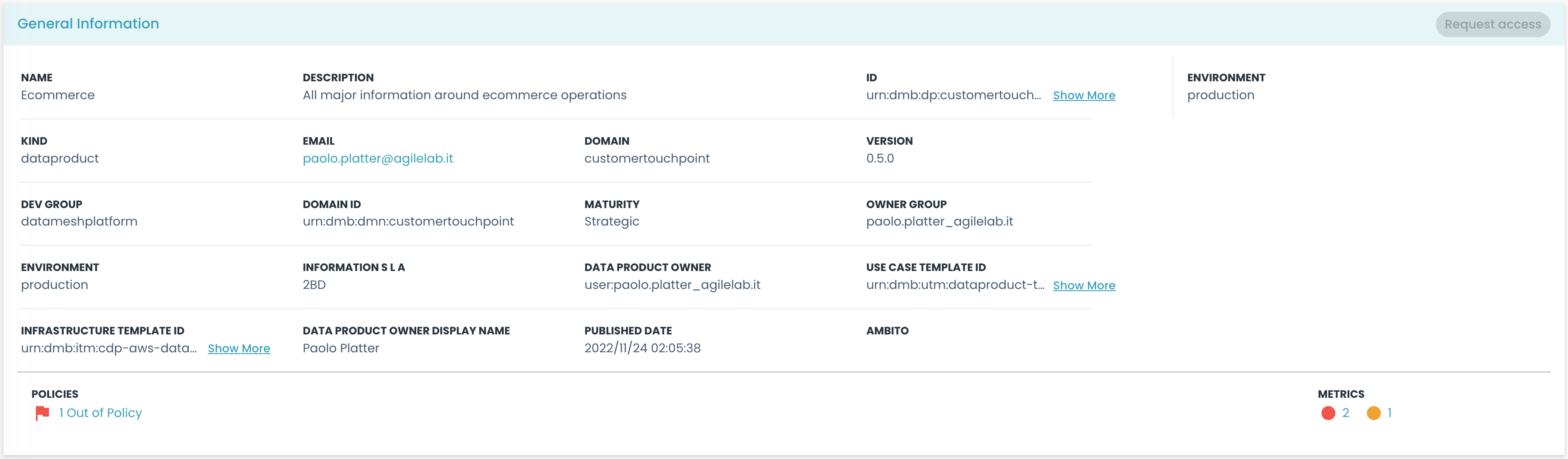
You can see the flag and score component in the image above, showing the metrics and policies' results in the bottom part of the card.
Example:
- type: marketplace_flag_and_score
Marketplace Violation Status Summary Flag Component
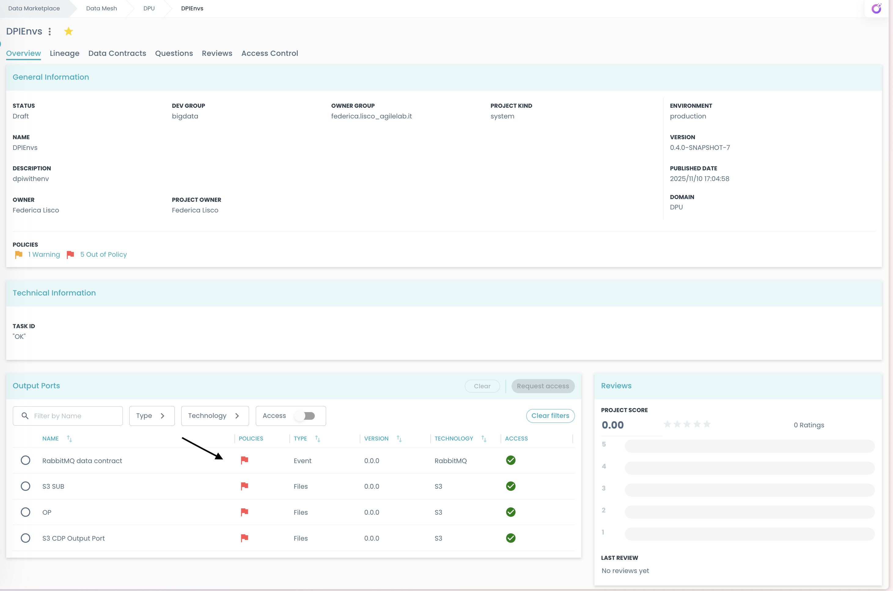
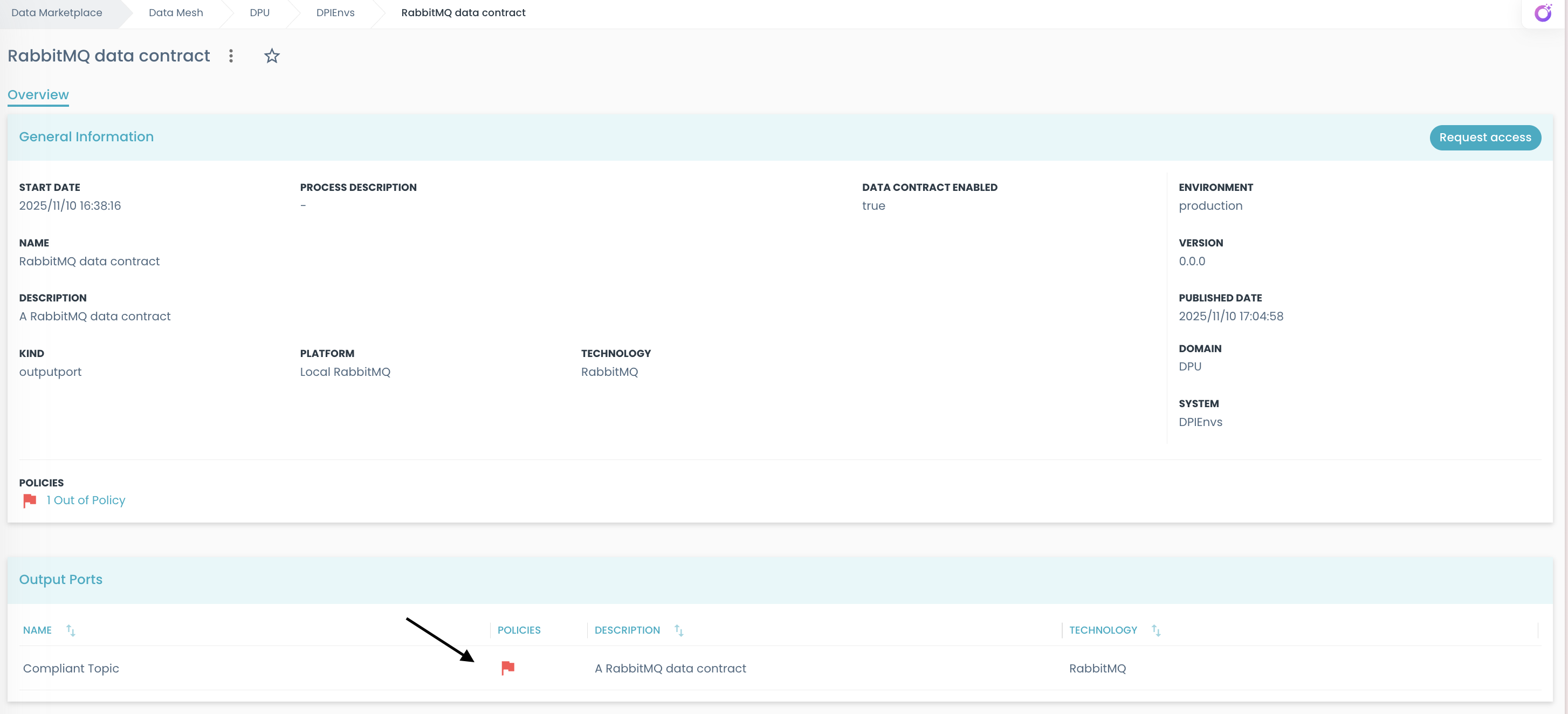
The marketplace violation status summary flag component displays a flag whenever the component or any of its subcomponents has a policy violation. The flag’s color reflects the highest severity level among the detected violations.
In this component, only the path is used and must be mapped to the path of a compatible object.
It is featured on the default marketplace_system and marketplace_component custom views, where it is introduced as a column in each _componentsByKind table and its path mapped to the value _policyViolationCount of each row in components.
Marketplace System page
Marketplace Component page
Example:
- type: violations-status-summary
  path: _policyViolationCount
  label: policies
  width: "100"
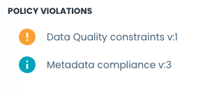
Marketplace Policy Violations Overview Component
The marketplace policy violations overview component displays a list of active violations for specific policies.
In this case, the path and value properties are not used. This component must be used in the marketplace pages.
Configurations:
title: title of the widgetpolicyIds: a list of policy IDs whose violations should be displayedhideIfEmpty: whether the widget should be hidden when there are no violations to shownoDataMessage: message to display when there are no violations to show andhideIfEmptyis set tofalse
Example:
- type: marketplace_policy_violations_overview
  title: Policy violations
  policyIds:
    [
      '45a9c41e-b8a1-4c32-95fd-cc6eeaf68a29',
      '143a38d1-8022-498c-8b98-1ecb48f43418',
    ]
  hideIfEmpty: false
  noDataMessage: No violations
Marketplace Metric Results Overview Component
The marketplace metric results overview component displays a list of latest results for specific active metrics.
In this case, the path and value properties are not used. This component must be used in the marketplace pages.
Configurations:
title: title of the widgetmetricIds: a list of metric IDs whose results should be displayedhideIfEmpty: whether the widget should be hidden when there are no results to shownoDataMessage: message to display when there are no results to show andhideIfEmptyis set tofalse
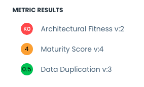
Example:
- type: marketplace_metric_results_overview
  title: Metric results
  metricIds:
    [
      'f4313ee5-8536-4d8e-be75-176c87fefedd',
      'af3c0ff6-f180-4ad9-aabc-2d33c49dc04a',
    ]
  hideIfEmpty: false
  noDataMessage: No results
Marketplace Data Contract Error Panel
The marketplace data contract error panel component is used to display errors of a data contract in a snackbar.
The snackbar will be displayed only if the outcome of the last policy evaluation is error, or if the last result details object is malformed.
If a message is specified in the path notes.errorSummary.message of the last result details, that message will be displayed in the snackbar instead of a generic one.
In this case, the path and value properties are not used. If the input component has no data contract data, nothing will be displayed.

Example:
- type: marketplace_data_contract_error_panel
This component must be used in a page where the input object is of type Marketplace Component
Marketplace Data Contract Policy Status Component
The marketplace data contract policy result component is used to display the validations of a data contract policy result in a tree table.
In this case, the path and value properties are not used. If the input component has no data contract data, nothing will be displayed.

Example:
- type: marketplace_data_contract_policy_status
This component must be used in a page where the input object is of type Marketplace Component
Marketplace Data Contract Quality Component
The marketplace data contract quality component is a data contract quality view, that is used in the data contracts drawer to display the data contract quality properties. For each property, if a field named code is present, it will be used as the header of the card for that property.
In this case, the path and value properties are not used. These components must be used in the marketplace pages, and they are not customizable.
Example:
- type: marketplace_data_contract_quality
Data Preview Component
The data preview component shows a preview of data.
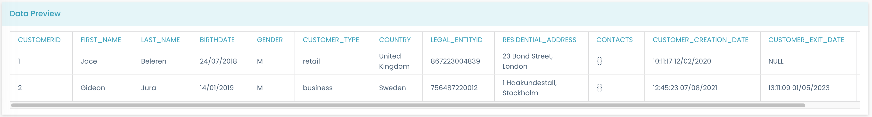
Configurations:
path: Specifies the path of the data to show.title: Specifies the title of the data preview card.hideNoDataIcon: Hide the no data icon in case no sample data is found.noDataLabel: Message to show to users in case no sample data is found.
Example:
- type: data_preview
  path: myDataPath
  title: Data Preview
This is capable of rendering a data preview filed with the following structure:
rows:
  - - '1'
    - Jace
    - Beleren
    - 24/07/2018
    - M
  - - '2'
    - Gideon
    - Jura
    - 14/01/2019
    - M
columns:
  - customer_id
  - first_name
  - last_name
  - birth_date
  - gender
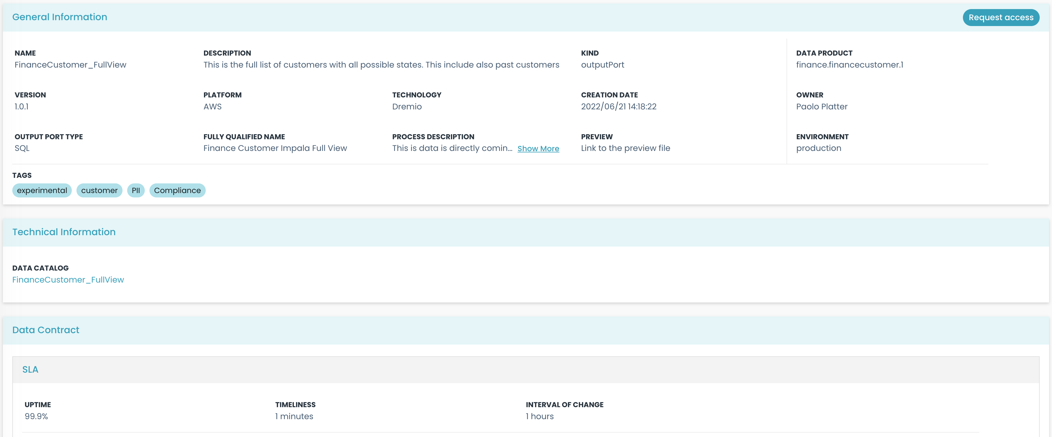
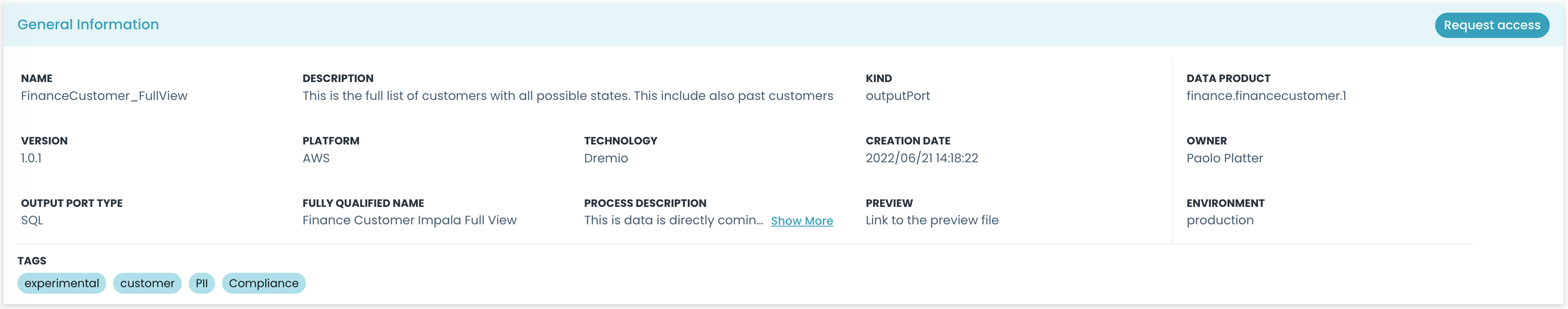
Marketplace Info Card Component
The marketplace info card component shows a card with the toolbar (containing the "Request Access" button). It behaves like a card, and it must be used to include the general details of the marketplace entity.
Configurations:
children: contains the elements that are shown inside the card.
Example:
- type: marketplace_info_card
  children:
    - type: string
      path: name
      label: Name
    - type: string
      path: description
      label: Description
Marketplace Tech Card Component
The marketplace_tech_card component shows a card containing Technical information coming from technology adapters.

Configurations:
title: Specifies the title of the card.configs: Specifies an array of field names, referring to the keys in which the technical information is contained. It defaults to the one defined in the configuration file (usually they are:info,buildInfo, anddeployInfo).maxLines: Defines the maximum number of rows displayed in the field before truncation occurs. If set to undefined or -1, the field will not be truncated. For values greater than 0, the text field is truncated, and hovering over it will show a tooltip containing the full text. -showMoreButton: Specifies if 'More'/'Less' button replaces the tooltip after truncation. -maxChars: Specifies the maximum number of characters a marketplace field can have before being treated as colSpan 2 (occupying two columns in the grid) instead of colSpan 1. If a specific colSpan is set in the field's configuration, that value takes precedence. If this is not defined, the field defaults to a colSpan of 1.
Example:
- type: marketplace_tech_card
  title: Technical Information
  maxLines: 2
  configs:
    - info
    - buildInfo
This component will render automatically all the elements defined in the fields passed as configs. Those objects should have a structure like:
info:
  dataCatalogLink:
    href: 'https://web.purview.azure.com/resource/datamesh-test/main/catalog/entity?guid=b6e871f8-a027-43ea-9801-71c6245377e7'
    type: 'string'
    label: 'Data Catalog'
    value: 'Link to the Data Catalog'
In this case, the UI will display a single element with the label "Data Catalog" and value "Link to the Data Catalog" that will redirect to the specified href.
Marketplace Component Card Component
The marketplace component card shows a card with the components toolbar (containing the "Request Access" button).
Configurations:
children: contains the elements that are shown inside the card.title: Specifies the title of the card.
Example:
- type: marketplace_component_card
  title: Components
  children:
  ...
Schema List Component
The schema list component transforms an input path that references a schema object into a list of schemas, with an associated semantic linking object (if found). If the path is already an array, it will return the list of schemas directly (enriched with semantic linking if defined).
Example:
- type: schema_list
  path: dataContract.schema
  children:
    - type: grid_sequence
      path: ''
      children:
      ...
Builder Components
Catalog System Card
The catalog system card component implements a card with the system object toolbar (containing the "Code" and "Refresh" buttons). It behaves like a card, and it must be used to include the general details of the catalog entity.
Configurations:
children: contains the elements that are shown inside the card.
Example:
- type: catalog_system_card
  children:
    - type: string
      path: name
      label: Name
    - type: string
      path: description
      label: Description
Catalog Component Card
The catalog component card component implements a card with the components object toolbar (containing the "Add" button). It behaves like a card, and it must be used to include the general details of the catalog entity; it is used to contain the list of components of a system.
Example:
- type: catalog_component_card
  children:
    - type: string
      path: name
      label: Name
    - type: string
      path: description
      label: Description
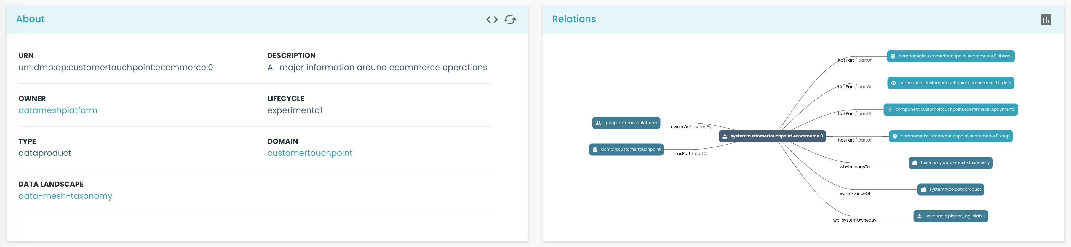
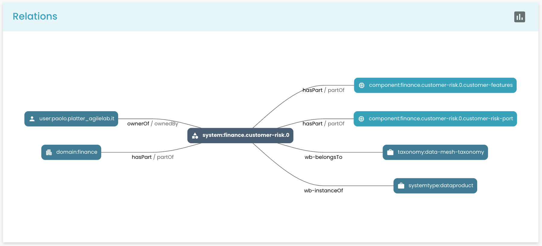
Catalog Relations Component
The catalog relations component shows the entity relations graph.
In this case, the path and value properties are not used. These components must be used in the marketplace pages, and they are not customizable.
Example:
- type: catalog_relations
Catalog Warnings Component
The catalog warnings component shows the entity warnings. This component must be included in the page to show the warnings, otherwise you will not see the panel on entities with an error.
Example:
- type: catalog_warnings
Catalog Components
The catalog components component shows the list of sub-components of a component. This is useful when you need to add sub-components to the components.
Example:
- type: catalog_components
Click Actions
When a component is clicked, it can trigger an action. The action is defined in the click property of the component. The action is a predefined code-defined action.
Here we report a list of all the actions that can be triggered by the components.
Show Component
The show component action is triggered by the table of components shown on the System Page of the marketplace. It shows the component clicked on a new page.
Example:
- type: table
  path: components
  click: showComponent
Set Selection Action
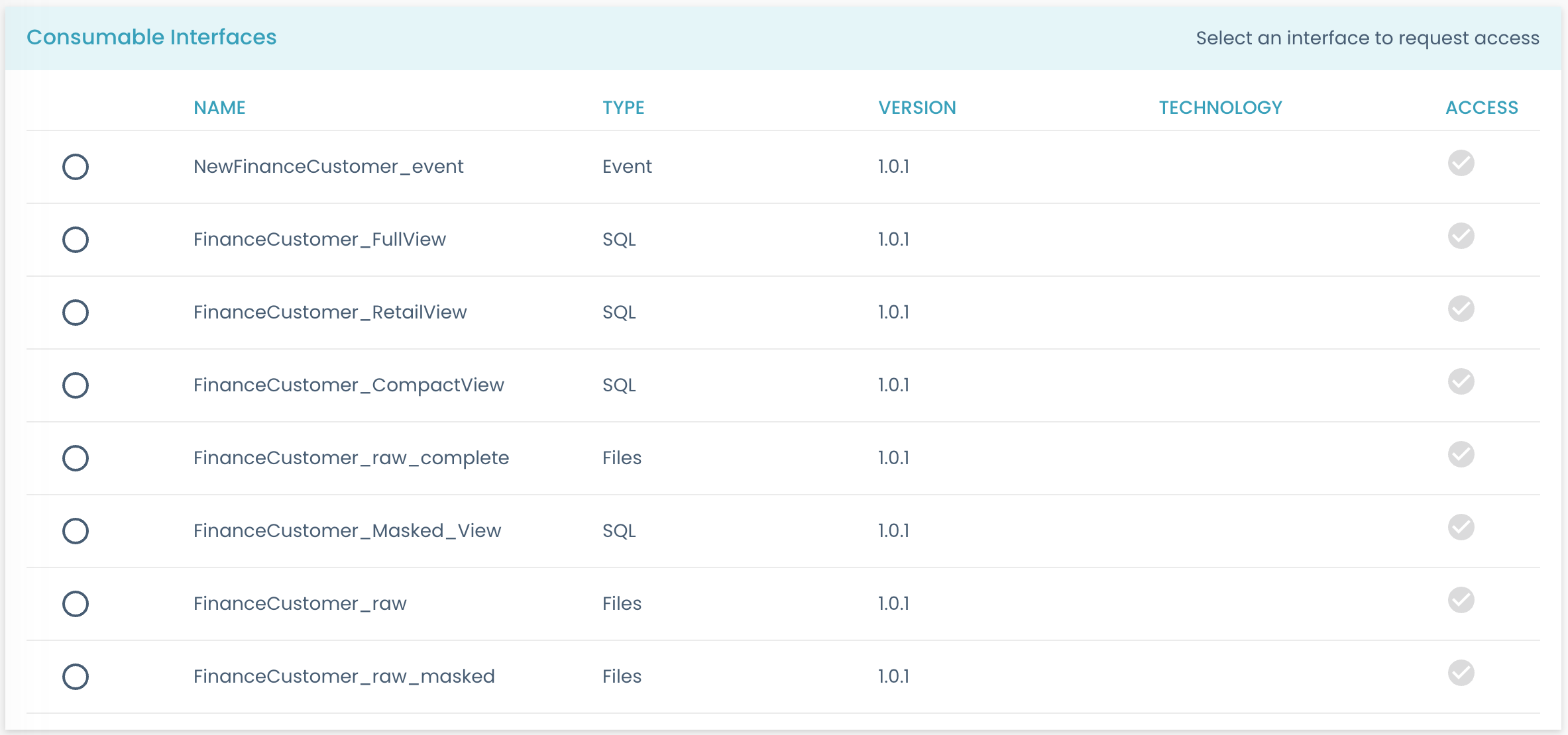
The set selection action is triggered when a user selects a specific option from the consumable interface card of the System Page in the marketplace. It allows the user to set a value or perform an action based on the selected option.
Example:
- type: radio
  path: selected
  width: 10%
  click: setSelection
  disabled: '{% if shoppable is not defined or _parent.shoppable == 'SHOPPABLE' %} true {% else %} false {% endif %}'
  disabledTooltip: 'This component is either non-shoppable or its system parent is shoppable. You cannot directly request access to it. In the case of a shoppable parent system, you have to request access from its General Information card.'
Show Sub Component Action
The show sub-component action is triggered when a user interacts with a component and wants to display additional information of the nested components in a drawer. It is used in the Consumable Interface Details Page in the marketplace.
Example:
- type: 'table'
  showRowWhen:
    value: '{{consumable}}'
    notEquals: false
  click: showSubcomponent
  path: components
Show Component Action
The show component action is triggered when a user wants to view the component of a System, from the System Page in the marketplace.
Example:
- type: table
  path: components
  click: showComponent
Show Semantic Link
The show semantic link action is triggered when a user wants to view the semantic link of a column in the schema of a component in the marketplace.
Example:
- type: row_link
  label: Semantic Link
  path: _semanticlink
  align: right
  click: showSemanticLink
Nunjucks functions
We also defined some useful pre-coded Nunjucks functions, to be used inside all the properties that accept Nunjucks values.
Some
The some function takes in input an array of objects, a key name present in the objects and the value it should compare with.
Returns true if at least one element in the array matches the value for the specified key.
In the following example, we check if, in the components array, at least one object has the property consumable to true
Example:
type: card
title: Consumable Interfaces
showWhenExists: _components
showWhen:
  value: '{{ _components | some("consumable", true) }}'
  equals: 'true'
Every
The every function takes in input an array of objects, a key name present in the objects and the value it should compare with.
Returns true if all the elements in the array match the value for the specified key.
In the following example, we check if, in the components array, all its objects have the property consumable to true
Example:
type: card
title: Consumable Interfaces
showWhenExists: _components
showWhen:
  value: '{{ _components | every("consumable", true) }}'
  equals: 'true'
System Prototype Section Card
A card that can contain arbitrary content inside and open the System Prototype Template in edit mode to a specific section.
The title field defines the title of the card.
The section field defines what section of the template will be opened upon clicking the Edit button. It must match the title of that specific section exactly.
Example:
type: system_prototype_section_card
title: Value Proposition
section: Value Proposition
System Prototype Blueprint
A component used to display a blueprint preview card associated with the prototype. Its value can be undefined (it will display an empty card) or must contain a blueprint ref when filled.
type: system_prototype_blueprint
path: 'blueprint'
System Prototype Status
A component to display the status of the System Prototype. Its value must contain the status of the prototype.
type: system_prototype_status
path: 'status'
System Prototype Information Prototyping
A component to showcase the relationships between the System Prototype and its selected Data Sources (must be refs) and Business Concepts in a graph.
type: system_prototype_information_prototyping
dataSourcesPath: parameters.Information Prototyping.dataSources
businessConceptsPath: parameters.Information Prototyping.businessConcepts